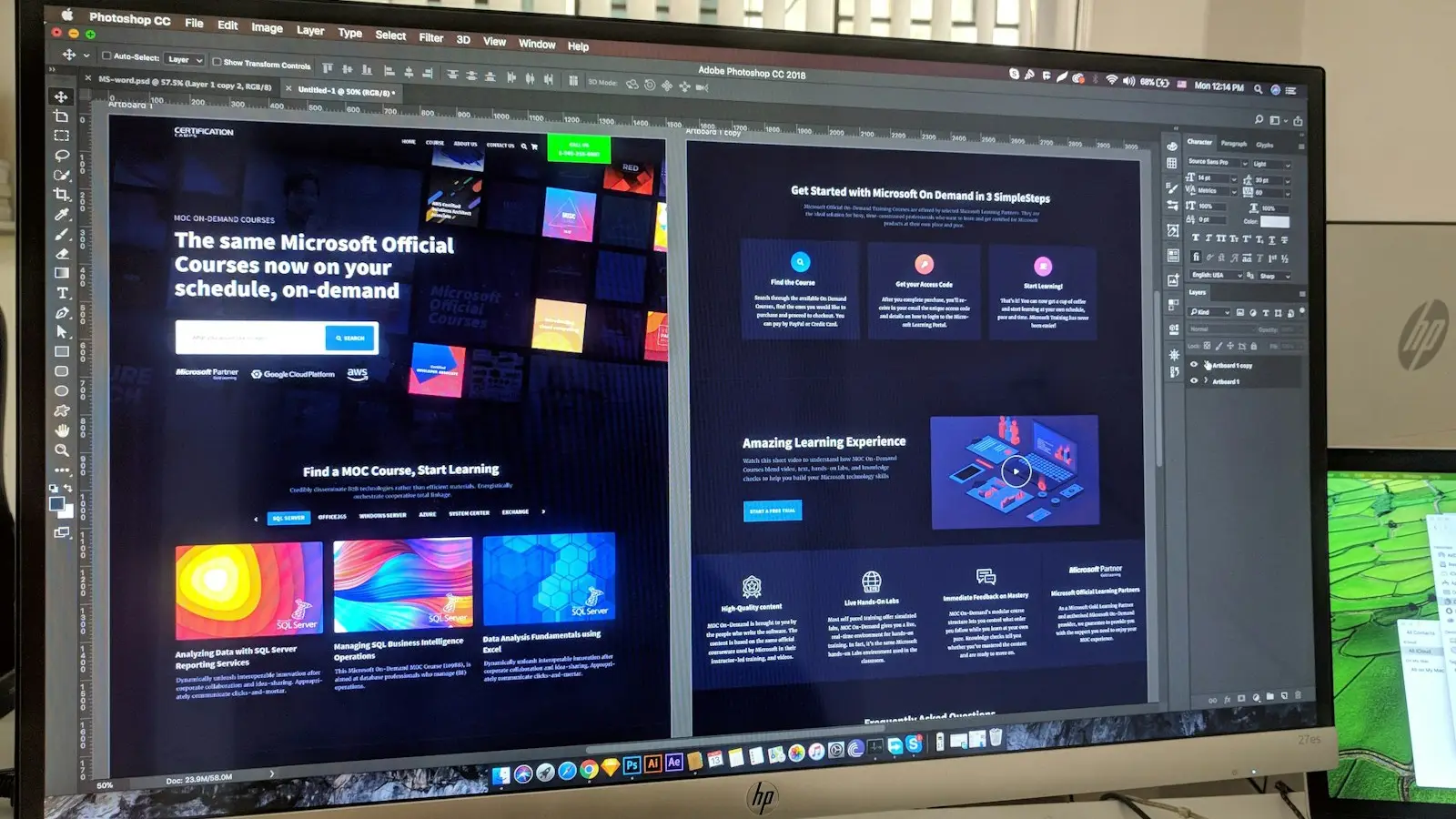



How behavioral psychology, fast rendering, Core Web Vitals, and accessibility work together to turn visitors into customers.
Most teams treat design and performance as separate workstreams: designers polish screens, engineers chase Lighthouse scores, and conversion is left to a marketing experiment later. In practice they are one system. A visitor decides within moments whether a page feels clear, fast, and trustworthy, and every layout choice, script, and word of copy feeds that judgment.
At Netstatic Solutions, we design and build enterprise and commercial web products where the interface, the code, and the measurement plan are planned together. This guide explains the principles we rely on, how to apply them without manipulating users, and how to verify that a change actually helped. You will learn:
- [Conversion Mindset:] Why a UI is a decision-support system, and what actually blocks a decision
- [Cognitive Load:] How Hick's law, Miller's chunking, and progressive disclosure simplify choices
- [Visual Hierarchy:] How F-pattern and Z-pattern scanning guide placement of headlines and calls to action
- [Trust and Friction:] Which trust signals matter, and how to design forms people actually finish
- [Motion and Performance:] Accessible micro-interactions, plus LCP, INP, and CLS targets as part of UX
- [Accessibility:] Why WCAG 2.2 AA is both an ethical baseline and a conversion advantage
- [Measurement and Ethics:] A/B testing discipline, dark patterns to avoid, and when not to optimize
Why UI Is a Conversion Problem, Not a Decoration Problem
A conversion is a decision: sign up, request a demo, add to cart, submit a claim, approve a workflow. Decisions fail for a small number of reasons. The user did not understand what to do, did not believe the promise, found the effort too high, or gave up because the page was slow or broken. Visual polish alone fixes none of those. Structure, wording, speed, and reliability fix all of them.
This is why the best conversion work starts with diagnosis rather than redesign. Session recordings, funnel analytics, support tickets, and moderated usability sessions show where people hesitate. The research archive at Nielsen Norman Group articles is a reliable source of tested usability heuristics, and most findings there are about removing doubt rather than adding persuasion.
The same logic holds for internal enterprise tools. When a procurement officer or support agent uses your product eight hours a day, conversion becomes task completion rate and error rate. The principles below apply equally to a landing page and to a complex enterprise SaaS dashboard.
Cognitive Load: Hick's Law, Chunking, and Progressive Disclosure
Working memory is limited and attention is expensive. Every extra element on screen, whether a menu item, banner, or badge, asks the user to spend effort deciding whether to ignore it. Reducing that load is the single most dependable way to improve completion. The catalogue at Laws of UX summarizes the principles used in this section in plain language.
Hick's Law: Fewer Competing Choices
Hick's law states that the time needed to decide increases with the number and complexity of options. It does not say fewer is always better, but it does say that undifferentiated choices slow people down. Practical applications:
- [One Primary Action:] Give each screen a single dominant call to action, and style secondary actions visibly weaker
- [Curated Navigation:] Keep top-level navigation to the destinations real users need, and move the rest into clearly named groups
- [Recommended Option:] On pricing or plan pages, mark a sensible default instead of presenting equal-weight choices
- [Smart Defaults:] Pre-fill what you reliably know, such as country or currency, and let users change it
Miller's Chunking and Scannable Structure
Miller's observation that short-term memory holds a limited number of items is often misquoted as a hard limit of seven. The useful lesson is chunking: group related information into labeled units. A 16-digit card number, a phone number, or a long specification table becomes manageable when it is divided into logical groups with whitespace and consistent labels.
Progressive Disclosure
Progressive disclosure shows the essentials first and reveals detail on demand. Accordions, tabs, expandable rows, and stepped flows all implement it. Done well, novices see a simple surface while experts can still reach advanced controls. Done badly, it hides information people need to decide, so never conceal pricing, constraints, or consequences behind an interaction.
Visual Hierarchy and Scanning Patterns
People rarely read pages; they scan for anchors. Research on eye tracking summarized by Nielsen Norman Group describes F-shaped scanning on text-heavy pages, where attention runs across the top, then down the left edge in shorter sweeps. Sparse pages with a clear focal point tend to follow a Z-shaped path from top-left to top-right, diagonally down, then across the bottom. These are tendencies, not laws, but they are useful defaults for placing content.
- [Headline First:] Put the value proposition at the top-left of the main content area, in plain language and the largest type on the page
- [Left-Edge Anchors:] Start subheadings, list items, and key terms with meaningful words, because the left edge is scanned more than the middle of a line
- [Size, Contrast, and Space:] Use scale, weight, and surrounding whitespace to signal importance, rather than decorating every element equally
- [Calls to Action at Decision Points:] Place the main action where the argument concludes, and repeat it after long sections instead of only at the top
- [Fitts's Law:] Make primary targets large enough and close enough to the user's likely pointer or thumb position, with comfortable spacing on mobile
Hierarchy also depends on consistency. If buttons, links, and alerts change style from page to page, users must relearn the interface each time. A small, documented design system with tokens for color, spacing, and type keeps hierarchy predictable and makes later tests easier to interpret. Our UI/UX design services start with this kind of system before individual screens.
Trust Signals and Social Proof
Trust is the precondition for every conversion that involves money, data, or commitment. Visitors infer trustworthiness from small cues: a professional layout, consistent language, a visible company identity, and clear answers to the questions that worry them. Social proof reduces perceived risk by showing that others have made the same choice successfully.
- [Verifiable Evidence:] Use real customer names with permission, real case studies, and links people can check. Never fabricate testimonials, counts, or logos
- [Transparent Policies:] Show pricing basis, delivery terms, refund policy, and data handling near the action they affect
- [Security Cues With Substance:] Display certifications or payment security badges only when they are genuine, current, and explained
- [Human Contact:] Provide a reachable support channel, a physical or registered business address, and named people where appropriate
For commerce, these cues have to survive the checkout moment. A buyer who sees an unexpected fee, a vague return policy, or a confusing payment error rarely gives a second chance. The patterns for e-commerce and retail experiences therefore lean heavily on early cost transparency and recoverable errors.
Forms and Friction Reduction
Forms are where intent meets effort, and they are often the largest single source of avoidable drop-off. The goal is not to remove every field but to remove every unnecessary one, and to make the remaining ones easy to complete correctly on the first try.
- [Ask Only What You Need:] Every field should have an owner and a purpose. If nobody uses the answer, delete the question
- [Labels Above Fields:] Use persistent visible labels, not placeholder text that vanishes while typing
- [Use the Right Input Types:] Set type, inputmode, and autocomplete so mobile keyboards and password managers help instead of hinder
- [Validate Kindly:] Explain errors in plain language next to the field, keep what the user typed, and move focus to the first problem on submit
- [Show Progress:] For multi-step flows, show the step count and allow going back without losing data
Example: An Accessible Form Field
The markup below shows a field with a visible label, a hint, the correct input type, and an error that assistive technology announces. The attributes follow guidance in the MDN accessibility documentation.
<div class="field">
  <label for="work-email">Work email</label>
  <input
    id="work-email"
    name="email"
    type="email"
    inputmode="email"
    autocomplete="email"
    required
    aria-describedby="work-email-hint work-email-error"
    aria-invalid="true"
  />
  <p id="work-email-hint">We only use this to send your quote.</p>
  <p id="work-email-error" role="alert">
    Enter an address like name@company.com.
  </p>
</div>
Note that the error is tied to the input through aria-describedby, so a screen reader reads it when the field is focused, and role="alert" announces it when it appears. Remove aria-invalid and the error message until validation actually fails.
Micro-Interactions and Motion That Help
Micro-interactions are the small responses an interface gives to user actions: a button press, a saved confirmation, a loading indicator. They provide feedback, communicate system status, and make an interface feel dependable. Motion should explain something, such as where an element came from or that an action succeeded, never merely entertain.
- [Immediate Feedback:] Acknowledge taps and clicks instantly, even if the network request takes longer, and show progress for longer waits
- [Short and Purposeful:] Keep transitions brief and avoid animation that delays a user who is trying to finish a task
- [Cheap to Render:] Animate
transformandopacityinstead of layout properties to avoid jank and layout shift - [Respect User Settings:] Honor the
prefers-reduced-motionmedia query, which some people enable for vestibular or attention reasons
The component below uses Motion for React (formerly Framer Motion) and its useReducedMotion hook to remove movement for users who requested it, while keeping the status message visible and announced.
'use client';

import { motion, useReducedMotion } from 'motion/react';

export function ConfirmationToast({ message }: { message: string }) {
  const reduceMotion = useReducedMotion();

  return (
    <motion.div
      role="status"
      initial={reduceMotion ? { opacity: 0 } : { opacity: 0, y: 12 }}
      animate={{ opacity: 1, y: 0 }}
      transition={{ duration: reduceMotion ? 0.01 : 0.2, ease: 'easeOut' }}
      className="border border-cyan-500 bg-black px-4 py-3 text-sm text-white"
    >
      {message}
    </motion.div>
  );
}
Performance Is User Experience
A page that is clear but slow is still a failed design. Loading delays, unresponsive taps, and content that jumps while someone is about to click all erode confidence. Core Web Vitals are Google's field-measured metrics for these three dimensions, and they give design and engineering teams a shared vocabulary.
| Metric | What It Captures | Good Threshold | Typical UX Fixes |
|---|---|---|---|
| Largest Contentful Paint (LCP) | How quickly the main content becomes visible | 2.5 seconds or less | Server-render above-the-fold content, size and prioritize the hero image, reduce render-blocking resources |
| Interaction to Next Paint (INP) | How quickly the page responds visually to user input | 200 milliseconds or less | Break up long tasks, ship less JavaScript, defer non-critical third-party scripts |
| Cumulative Layout Shift (CLS) | How much content unexpectedly moves while loading | 0.1 or less | Reserve space for images, embeds, and ads; avoid inserting content above existing content |
These thresholds are assessed at the 75th percentile of real page loads, separately for mobile and desktop, so the experience of slower phones and networks matters more than a developer laptop. Treat lab tools such as Lighthouse as diagnostic aids and field data from real users as the verdict.
Design decisions influence every one of these numbers. A full-bleed autoplay video hero, unoptimized web fonts, a carousel that loads six large images, and a chat widget injected late are design choices with measurable costs. Pairing design with a rendering strategy, as described in our guide to modern Next.js, edge, and serverless architecture, lets teams keep rich visuals while staying inside budget.
Delivery infrastructure matters too. Caching, image transformation, and regional hosting decisions made on the cloud infrastructure side directly shape time to first byte and LCP, particularly for audiences far from the origin server. Builds that serve web and native clients from shared APIs, like those in our web and mobile platform engineering, benefit from a single set of performance targets.
Accessibility as a Conversion Foundation
Accessibility is sometimes framed as compliance work, yet its practical effect is broader usability. The Web Content Accessibility Guidelines 2.2 define testable success criteria, and level AA is the common target for commercial and public-sector products. Many requirements describe good design anyway.
- [Color Contrast:] WCAG requires a contrast ratio of at least 4.5:1 for normal text and 3:1 for large text and essential interface components. Do not rely on color alone to convey meaning
- [Keyboard Operability:] Every control must work without a mouse, in a logical focus order, with a clearly visible focus indicator that is never removed without replacement
- [Semantic HTML:] Use real buttons, links, headings, lists, and form labels first, and add ARIA only where native elements cannot express the behavior
- [Target Size and Dragging:] WCAG 2.2 adds criteria for minimum target size and for alternatives to dragging gestures, which helps touch and motor accessibility
- [Text Alternatives and Captions:] Provide meaningful alt text, captions for video, and transcripts where speech carries information
Automated checkers catch only part of the issues, so combine them with keyboard-only walkthroughs, screen reader checks, and testing with people who use assistive technology. Building these checks into design reviews and CI is far cheaper than retrofitting a finished product, and it widens the audience who can complete your funnel.
A/B Testing and Measurement
Principles tell you where to look; experiments tell you what works for your users. A disciplined program starts with a hypothesis tied to observed behavior, a single primary metric, and a pre-agreed sample size. Without that discipline, tests produce noise that looks like insight.
| Method | Best For | Needs | Main Risk |
|---|---|---|---|
| A/B test | Comparing two versions of one change on live traffic | Enough traffic, a clear primary metric, a pre-set duration | Stopping early or testing many variants and trusting chance wins |
| Multivariate test | Understanding how several elements interact | Substantially more traffic than a simple A/B test | Underpowered results on modest-traffic sites |
| Moderated usability test | Finding why people struggle | A handful of representative participants and a task script | Small samples show problems, not their frequency |
| Session recordings and heatmaps | Spotting rage clicks, dead ends, and ignored content | Privacy-safe tooling and consent where required | Over-reading anecdotes without funnel data |
| Funnel and cohort analytics | Locating the biggest drop-off and tracking trends | Consistent event tracking across steps | Counting events that do not reflect real intent |
- [Measure Guardrails:] Track metrics that should not get worse, such as error rate, refunds, support contacts, and Core Web Vitals, alongside the headline conversion rate
- [Segment Carefully:] Check mobile and desktop and new and returning users separately, since an average can hide a loss in one group
- [Avoid Flicker:] Serve variants from the server or edge instead of swapping content after load, which can cause layout shift and bias results
Dark Patterns to Avoid
Behavioral psychology can help people decide, or it can be exploited to push them into decisions they would reject if they understood them. The second approach is called a dark pattern, and it is a poor trade even before regulators take an interest. Short-term lifts are paid for with refunds, chargebacks, complaints, and lost trust.
Hidden Costs
Fees, taxes, or mandatory add-ons revealed only at the last step of checkout.
Confirmshaming
Decline buttons worded to make users feel foolish, such as "No thanks, I hate saving money".
Pre-Selected Extras
Pre-ticked boxes for insurance, newsletters, or subscriptions the user did not request.
Fake Urgency and Scarcity
Countdown timers that reset, or "only 2 left" messages that are not based on real inventory.
Roach Motel Flows
Sign-up in one click but cancellation that requires a phone call or a maze of screens.
Disguised Ads and Misdirection
Visual emphasis that tricks users into clicking something they did not intend.
A useful test for any persuasive element: would the user feel respected if they saw exactly how and why it was designed? If the answer is no, redesign it. Honest clarity usually converts the right people, and the right people stay.
When Not to Over-Optimize
Conversion work has diminishing returns, and some contexts make it counterproductive. Know when to stop.
- [Low Traffic:] With only a few hundred visitors a month, A/B tests rarely reach reliable conclusions. Use qualitative research and sound heuristics instead
- [Unproven Offer:] No interface can rescue a product people do not want. Validate the value proposition before polishing button colors
- [Complex Considered Purchases:] For high-stakes B2B decisions, depth of information and credible proof matter more than shaving a click
- [Accessibility Conflicts:] If a tweak improves a number but excludes users or breaks assistive technology, do not ship it
How Netstatic Approaches High-Conversion Design
Our process treats design, engineering, and analytics as one team effort rather than a hand-off chain.
- [Discovery:] We map user goals, business goals, and the current funnel, and interview stakeholders and users to find where decisions stall
- [Design System First:] We establish reusable tokens and components so hierarchy, spacing, and accessibility are consistent and testable
- [Performance by Default:] We choose rendering strategies and asset policies that protect LCP, INP, and CLS from the start, and we review budgets with designers
- [Accessible Builds:] Semantic components, keyboard testing, and contrast checks are part of the definition of done
- [Instrumentation and Iteration:] We define events and success metrics before launch, then improve using evidence rather than opinion
Because our teams also build the underlying platforms, including mobile clients described in our article on cloud-native mobile development, design decisions are checked against technical reality early, when changes are cheap.
Conclusion
High-conversion UI/UX is not a bag of persuasion tricks. It is the combination of clear structure, low cognitive load, honest trust signals, frictionless forms, fast and stable rendering, and accessibility that lets every visitor take part. Measure with discipline, respect users, and improve in small evidence-backed steps. If you want a team that treats these as one engineering problem, you can talk to our team about your product at any stage, from audit to full build.
Ready to Turn More Visitors Into Customers?
Share your product and goals, and we will review your funnel, performance, and accessibility, then outline practical improvements ranked by expected impact and effort.
Request a UX and Performance Review →Frequently Asked Questions (FAQ)
1. What makes a UI high-converting? +
A high-converting UI makes the next step obvious, keeps effort low, and earns trust at the moment of decision. It uses clear visual hierarchy, few competing choices, honest copy, fast loading, and accessible controls. Conversion is the result of reducing doubt and friction, not of adding pressure or visual tricks.
2. What is Hick's law and how does it apply to web design? +
Hick's law says decision time grows as the number of choices grows. In web design it means limiting competing options, such as navigation items, pricing tiers, or calls to action on one screen. Group related choices, highlight a recommended path, and reveal advanced options only when the user asks for them.
3. What are the good thresholds for Core Web Vitals? +
Google's published thresholds for a good experience, measured at the 75th percentile of real visits, are Largest Contentful Paint of 2.5 seconds or less, Interaction to Next Paint of 200 milliseconds or less, and Cumulative Layout Shift of 0.1 or less. Measure them with field data, not only lab tests.
4. Does website speed really affect conversion? +
Speed shapes whether people stay long enough to act. Slow loading, delayed responses to taps, and shifting layouts all add frustration and doubt. The size of the effect differs by product and audience, so measure your own funnel before and after performance work instead of relying on borrowed numbers.
5. Is accessibility part of conversion optimization? +
Yes. Accessible design removes barriers for people using keyboards, screen readers, zoom, or voice control, and the same fixes, such as clear labels, strong contrast, and visible focus, also help everyone on small screens or in poor lighting. Treat WCAG 2.2 AA as a baseline for any product that must convert broadly.
6. How long should an A/B test run? +
Run it until you reach the sample size you calculated in advance, and cover at least one or two full business cycles so weekday and weekend behavior are both included. Stopping early the moment a result looks good inflates false positives. Decide the metric, the minimum detectable effect, and the stopping rule before launch.
7. What are dark patterns and why should they be avoided? +
Dark patterns are interface tricks that push people into choices they did not intend, such as hidden fees, pre-ticked boxes, fake urgency, or cancellation flows that are hard to find. They may lift short-term numbers, but they damage trust, raise support and refund costs, and can create legal and regulatory risk.
8. When should a team not over-optimize a UI? +
Avoid heavy optimization when traffic is too low for reliable tests, when the product or offer is still unproven, or when a fix would harm accessibility or trust. Early on, talk to users and fix obvious usability problems first. Micro-tweaks pay off only after the fundamentals and the underlying value are solid.